Beige tiles: the subtleties of creating a harmonious interior
Beige tile is an original stylistic solution for wall and floor decoration of the dwelling. It has unlimited possibilities for design, however, to create a harmonious interior, it obeys certain rules.

What happens?
Tile - a very durable material, which varies depending on the raw material included in the composition. This building material which divided into two types: for walls and floor. The first version is visually thinner, the second is noticeably heavier.
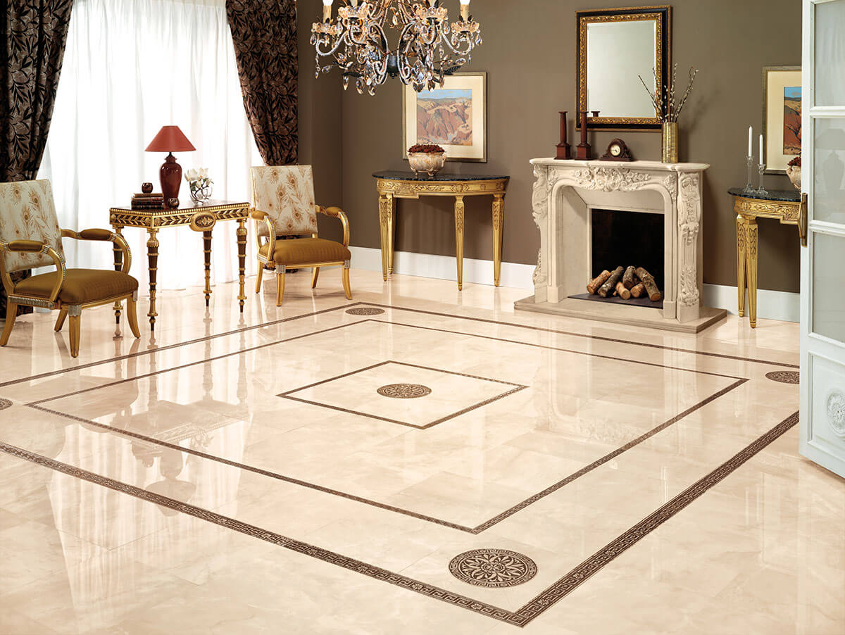
The appearance of the beige tile allows you to successfully fit it into different stylistics. If earlier the texture was predominantly glossy, today trademarks offer products with a matte, embossed, rough surface to the attention of buyers. Products with gloss look beautiful, give the space volume, visually increase it, but are quite slipperytherefore, it is often necessary to lay a carpet in rooms with such tiles. In addition, any contamination on this surface immediately catch the eye.
Variants with relief look very impressive, they are able to convey a variety of textures, among which the imitations of natural stone, marble, wood, three-dimensional mosaic, and decorative plaster are particularly interesting.
However, this technique is relevant for wall material, as it has two drawbacks:
- it is not always pleasant to walk on such a floor;
- care for this tile is somewhat more complicated.
With regards to matt varieties, it is worth noting that today they are among the most sought after, although in some respects such an texture imposes a certain style: they harmoniously look in ethnic interiors and areas related to the villa theme.


Sizes and price
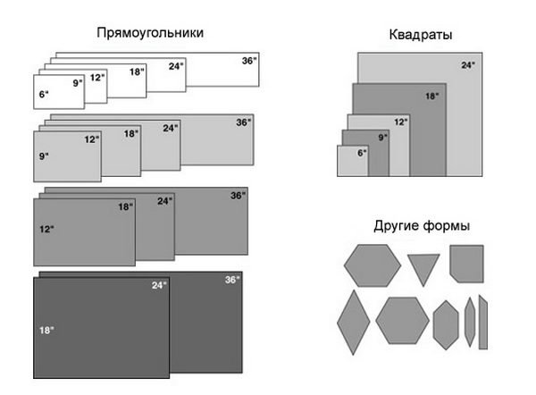
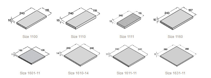
The dimensions of a beige tile can be different and are subject to its specific type. For example:
- the thickness of domestic and imported wall tiles is 6-7 mm, while the dimensions can be 10x10, 20x25, 20x30, 25x33, 25x35, 25x40, 20x50, 25x50, 35x35 cm;
- the dimensions of the thickness of the floor material of domestic companies are 8–11 mm, imported - 7–10 mm, while the dimensions of the tile itself can be 15x15, 20x30, 20x20, 30x30, 32x32, 40x40, 45x45, 50x50, 40x80 cm.
The porcelain stoneware figures are different. It is larger in thickness and in size, it can be square and rectangular, sometimes reaching a figure of 30x100 cm. The frost resistance parameters of wall and floor tiles are the same. The price is noticeably different: the wall is from 150 to 500 rubles per 1 square. m, for the floor will have to pay from 500 to 1000 rubles per 1 square. m
Benefits of using
Beige shade has a lot of advantages. Through tiles of this color, you can:
- zone the space into separate functional areas;
- to bring into the space of any room a maximum of light and heat;
- to combine in the decoration of different fragments in size and color;
- support the design of the space with regard to practicality;

- demonstrate the desired design idea;
- unobtrusively create the organization of the right place, combining tile with another facing material;
- perform a unique type of coating with the system "warm floor";
- to give the interior individuality, pointing out the delicate taste of the owners of the dwelling.
Subtleties of use
The beige color of the tile is multifaceted.It can be light, dark, saturated, diluted, cold or warm. Depending on the amount of red or blue paint in it, it can turn into a cold sandy, soft, bleached coffee, creamy beige, yellowish beige, beige and gray. In harmony, this is what is important: you need to be able to choose a shade, this will allow you to perform the lining to match the specified color type of the interior.
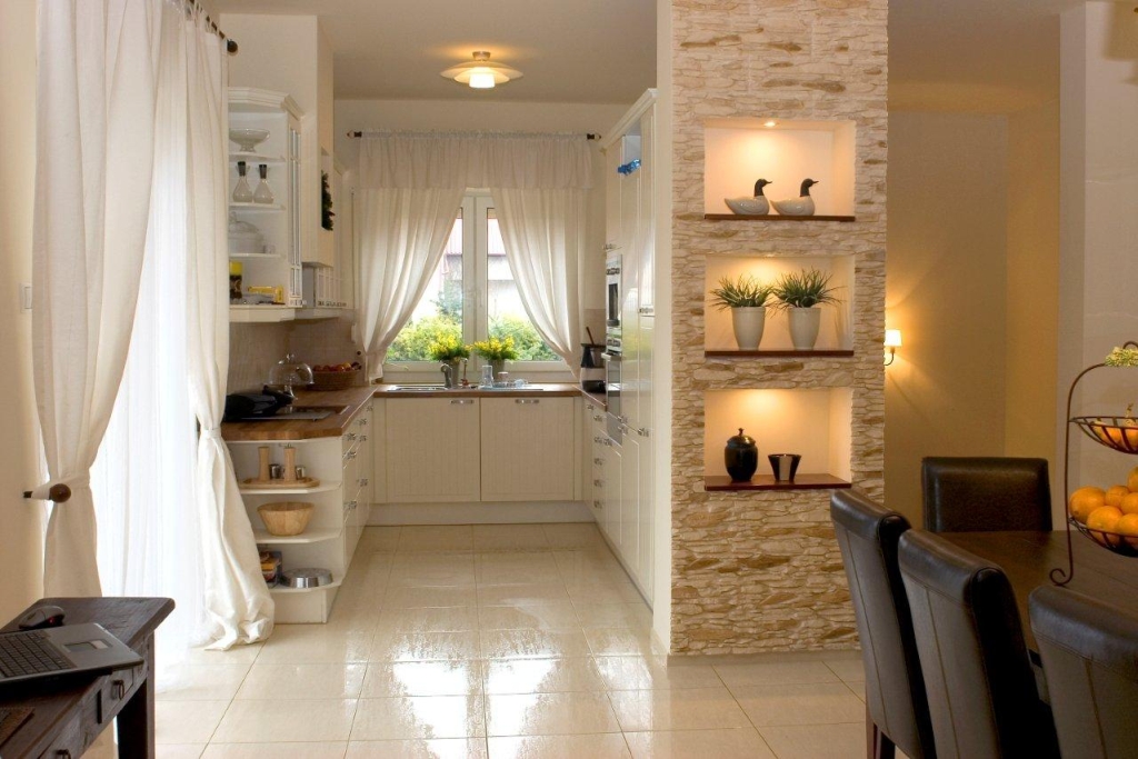
Due to the basic color beige tile can be located in different rooms of the home. Especially it is appropriate in places of high cross (in the kitchen, bathroom, hallway). Today it is actively used to decorate living rooms, glazed loggias and balconies. Its relevance depends on the background, texture, pattern, as well as location.

Beige can be conveyed by background or pattern. So that the material is not considered controversial, the contrast should be soft with a beige dominance. So it is possible to bring the atmosphere of a home into different rooms.
It is unacceptable to use a large number of black and red tones of the print: this color is much more pleasantly combined with shades of pastel and related tones.
The former include gray-pink, gray, milky, muted blue, turquoise, peach and metallic.
The most harmonious combination with related tones is a combination of beige with coffee, rich brown, chocolate, taupe, light shade of wenge oak. An interesting duet with swamp color.

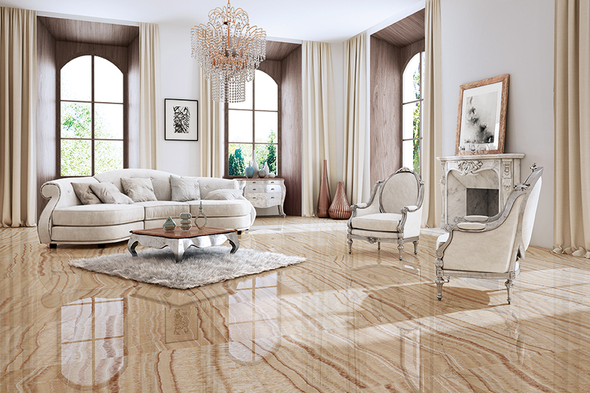
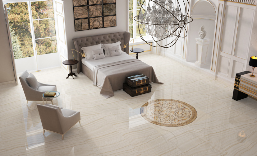
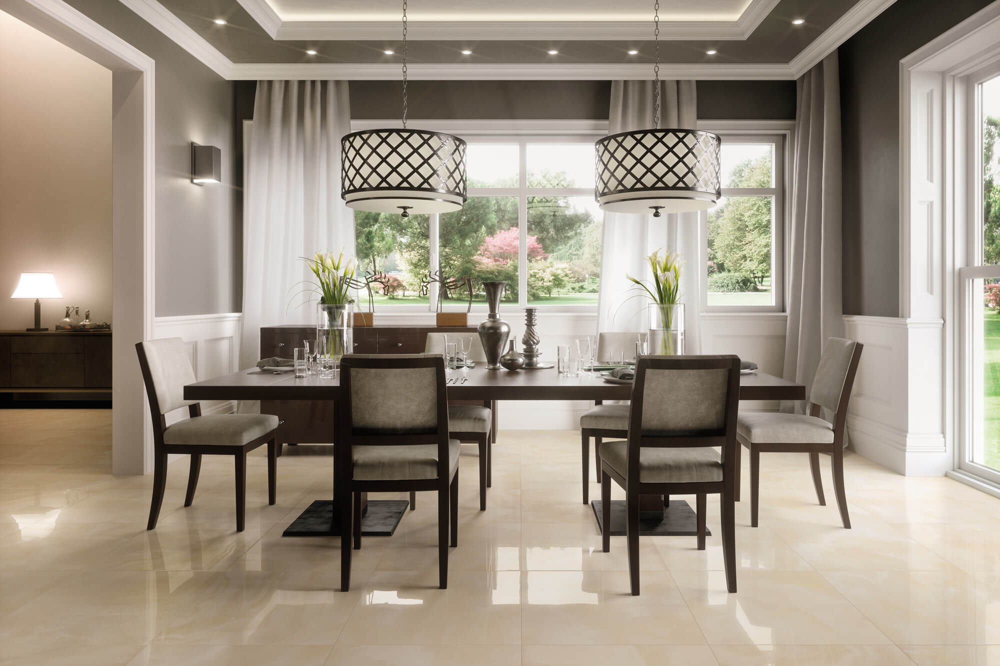
In the living room is appropriate glossy ceramic tiles. It is also suitable for the corridor: these places are usually not overloaded with furniture. It should be borne in mind: the abundance of tiles on the walls and the floor at the same time can cause discomfort. It is appropriate in the bathroom, bathroom, in the kitchen. but in the living room, the combination of two types of tiles should be moderate, otherwise internal discomfort will be created.
It looks great in an open-plan apartment (for example, on the floor and in the kitchen apron area). In a separate living room, it can be either one floor or only a part of it (for example, if you combine tile with laminate for certain areas of the room). For the corridor, tile can be laid at the threshold, covering the rest of the space with laminate or linoleum. So it will be practical, while looking new and stylish.


You should not choose the color of the facing material to match the walls or the ceiling: the perfect hit will not work, but it is quite possible to give one of the shades a feeling of ignorance.
If you want to make a room in bright colors, you can choose a light or dark beige, but the contrasting tone should be different. In this case, it is difficult to show the versatility of the shade, because the texture of the furniture, wall, floor and stream coating will be different. More harmoniously show the game of shades of the same color due to the design of the tile (pattern).
Design
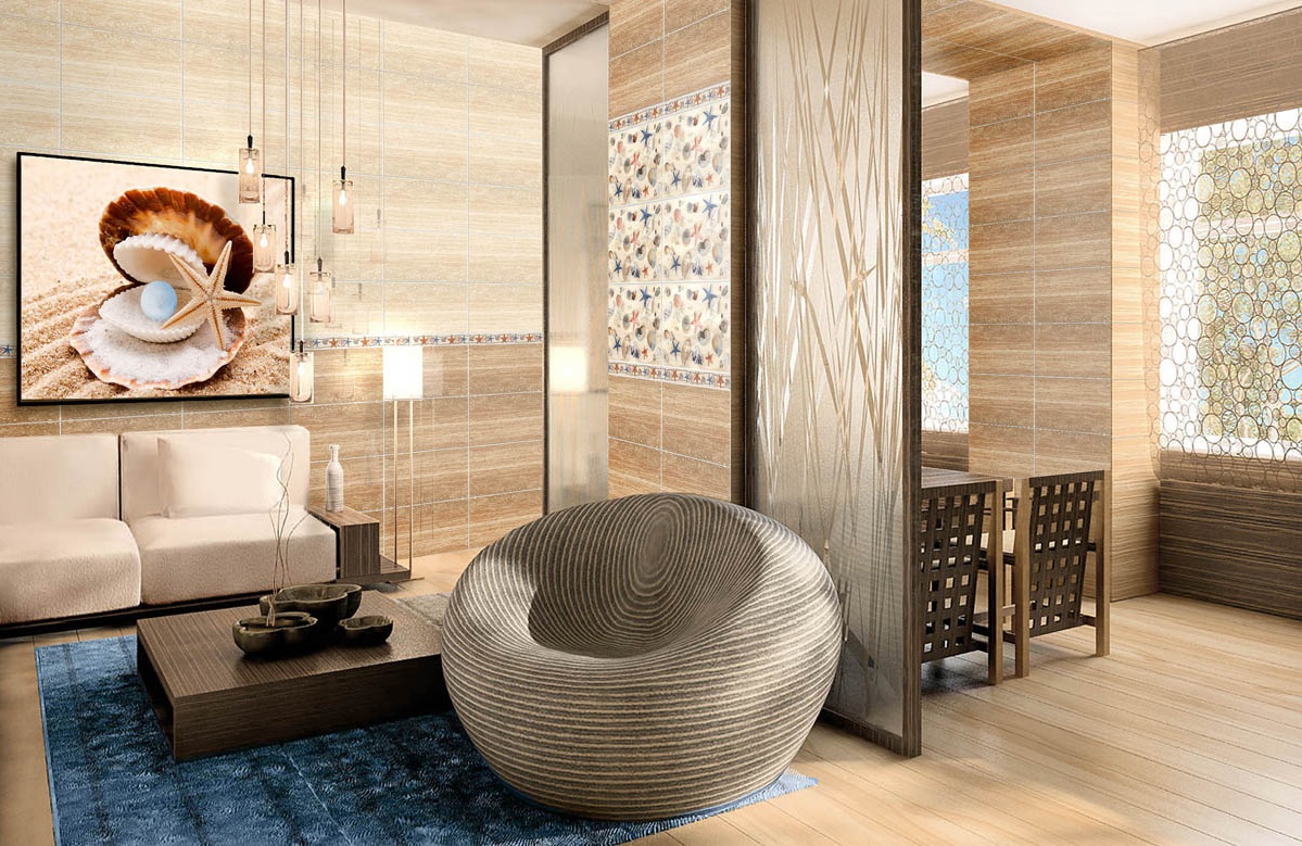
Today, surface tiling resembles art. It is done deliberately, good, the range of products opens up unlimited possibilities for decorating walls and floors.
To date, the actual use of companions. Buy two types of material that is designed for one facing series. At the same time, the possibilities are such that it is possible to emphasize vertical and horizontal planes with identical pattern and color. This is convenient in cases when you need to zone a space or point to a single interior ensemble, because the walls define the general background,and the floor is a smoothing touch.
The sought-after drawings, in addition to the imitational texture, are:
- elements of monograms;
- lace decor;
- flower motifs;
- plants and leaves;
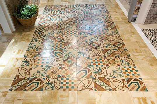
- contrast mosaic;
- geometric figures;
- branches and curly lines.
Some fragments contain themes relevant to the kitchen. These include a variety of coffee sketches with cups and saucers, fruits, glasses, teapots and similar patterns.
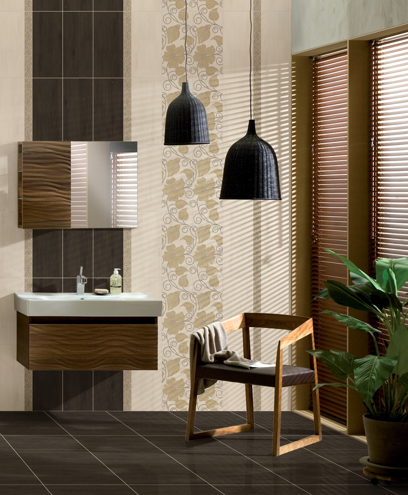
Types for a living room are more prone to stylization: complemented by a border in a similar pattern, they look stylish, holistic and beautiful. However, it is important to note that there should not be many prints. Thus, instead of harmony, one can give space and boredom to space.

Combination with furniture
Beige tile looks great next to upholstered and kitchen furniture. Especially it concerns products in light shades. Despite the fact that the beige and light itself, white color makes it lighter and more airy.
A good option is the one with light gray furniture: today such a duet is especially popular with the support of white and contrasting color spots. For example, the furniture can be light gray, the floor is beige, the ceiling is white, the connecting color is silver, brown, dark gray.

If the style is designed flooring in combination with dark furniture, beige color tiles gently emphasize the shade of furniture, even if it is purple or wine. In this case, the furniture will dominate, so the dark strokes in the tile finish should not be much.
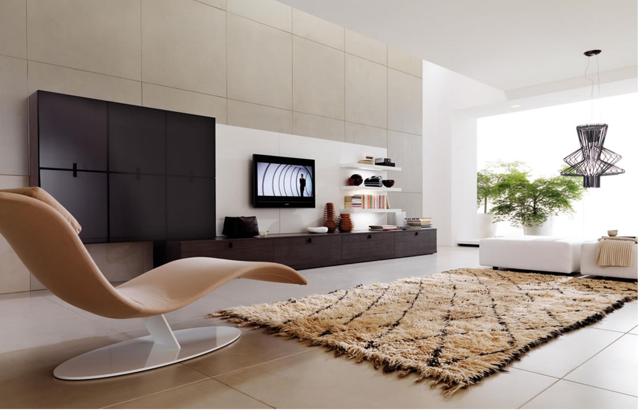
It is more harmonious to supplement the interior with a soft long-pile carpet, a coffee table or a table with a glass surface. You can add to the situation a couple of chairs, poufs. They will soften the visually cool floor effect.

If a glossy tile is chosen as the basis, you should not furnish the interior with a brilliant type of furniture surfaces. Showcase cabinets here will not look organically. Oddly enough, it would be more appropriate to use the same masonry of a fireplace or a fake fireplace, or an imitation of a brick using matte wallpaper. So you can create an atmosphere of comfort and overall harmony.
If the texture of the tile is replete with gloss, it can quickly get bored, so It is worth balancing the presence of gloss by selecting matte capes on upholstered furniture.. It is undesirable in this case to draw up the upper edge of the room with a stretch ceiling: a matte two-level version would be quite appropriate.
Beautiful examples
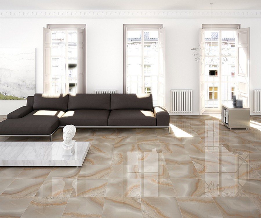
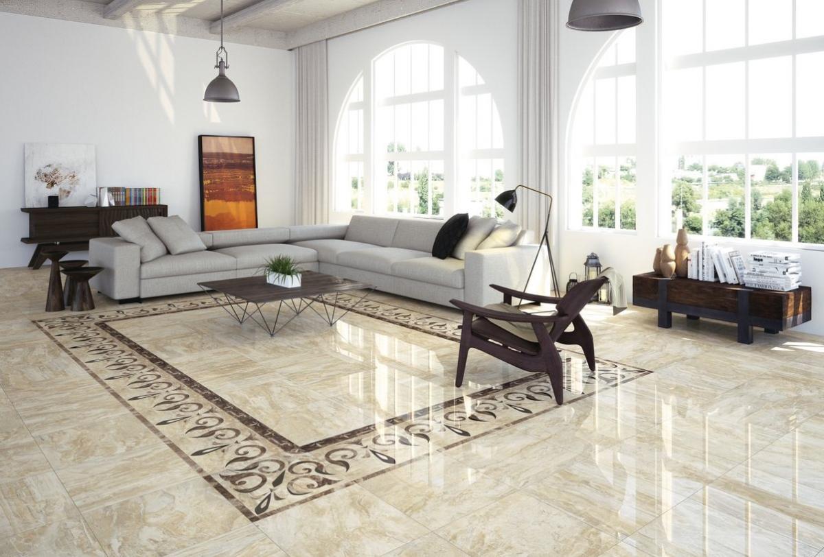
To see firsthand how beautiful the beige tile looks in the interior, you can look at the examples of the presented photo gallery. Glossy tile with a border and a pattern of gray allows you to create a stylish accent.

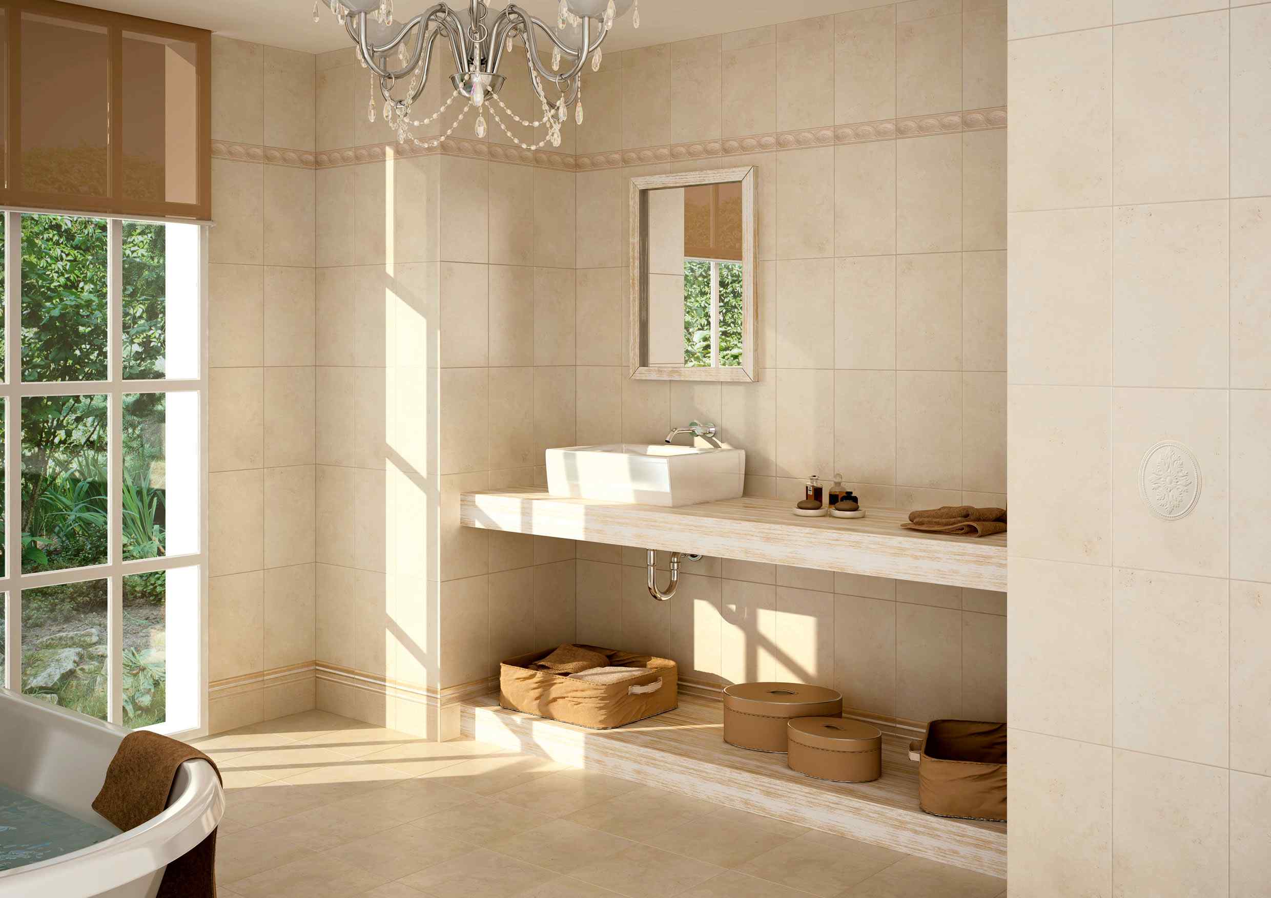
If the space is replete with small details, you need a one-colored tile.
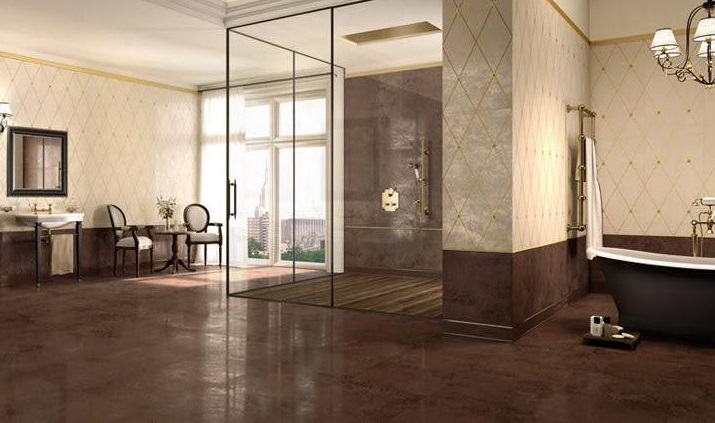
To exclude the ordinary, it is necessary to add facing with a contrasting tile with a pattern, supporting the shade of the pattern by means of a carpet.
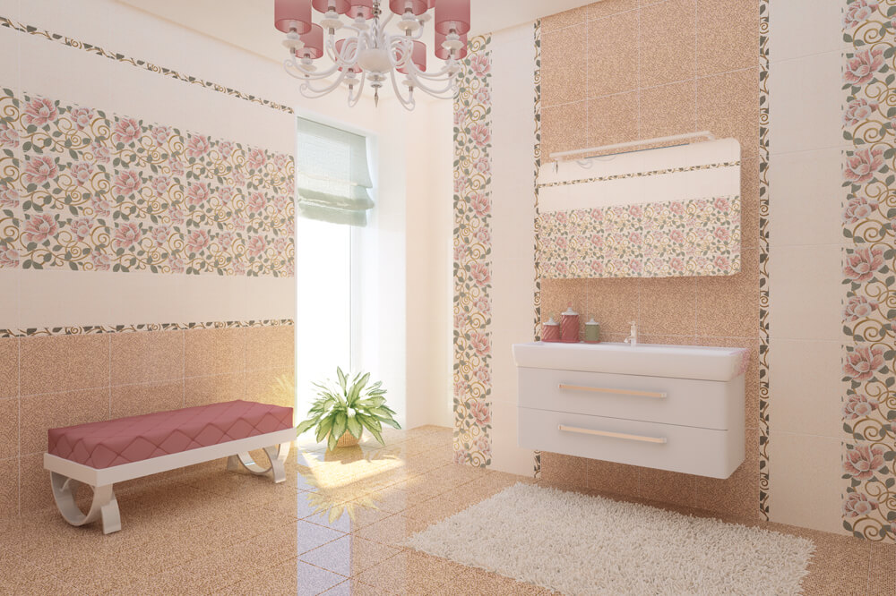
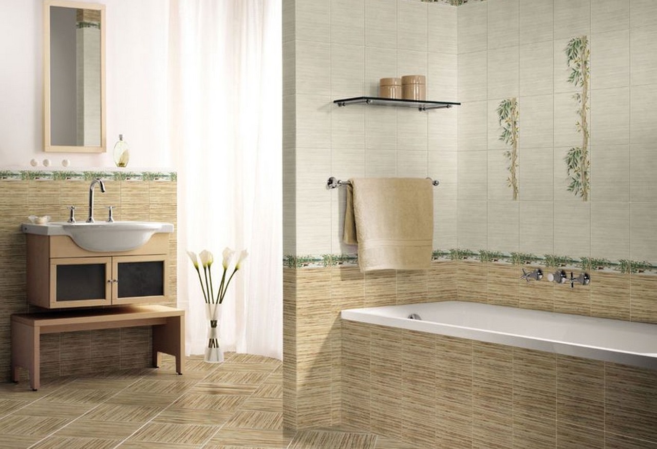
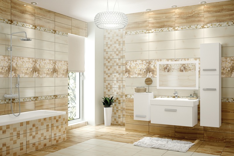
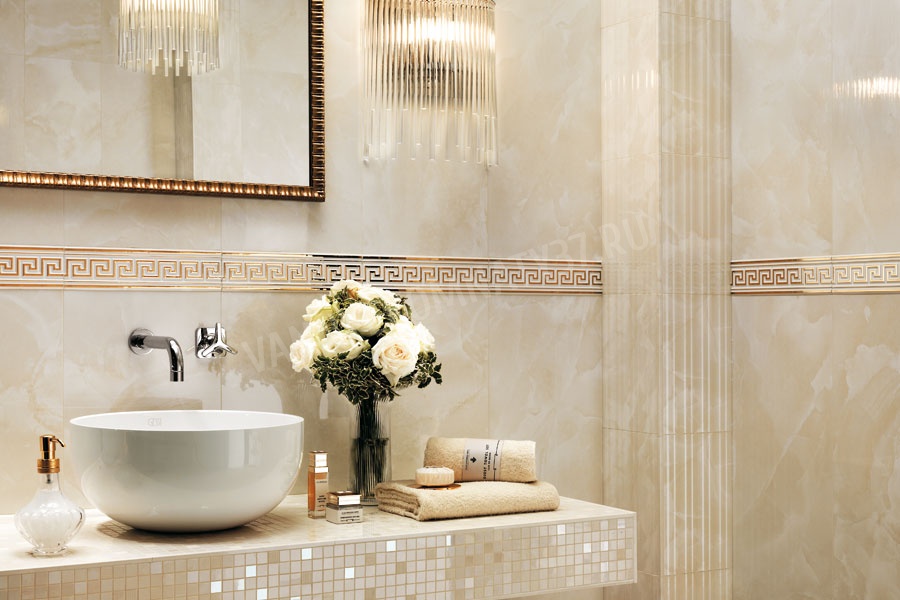
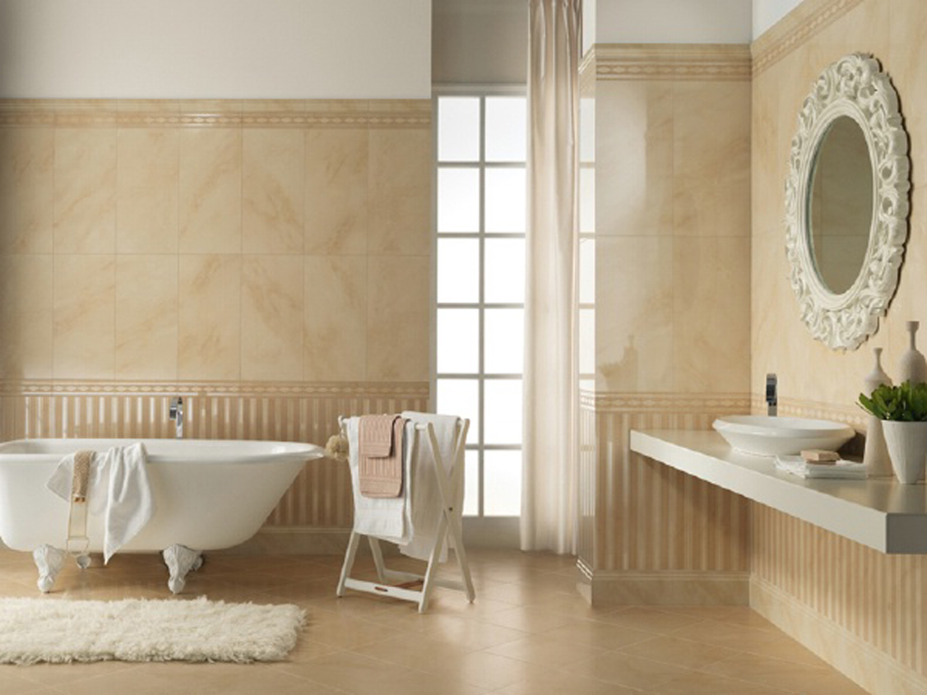
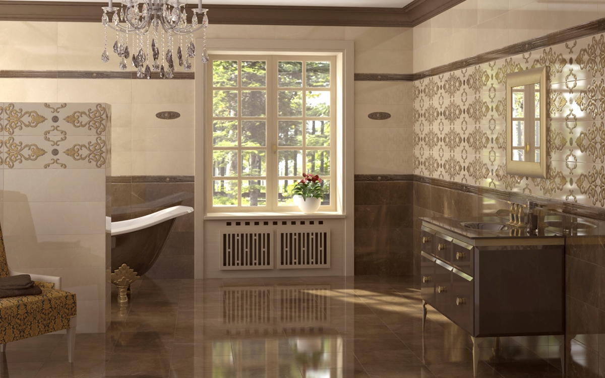
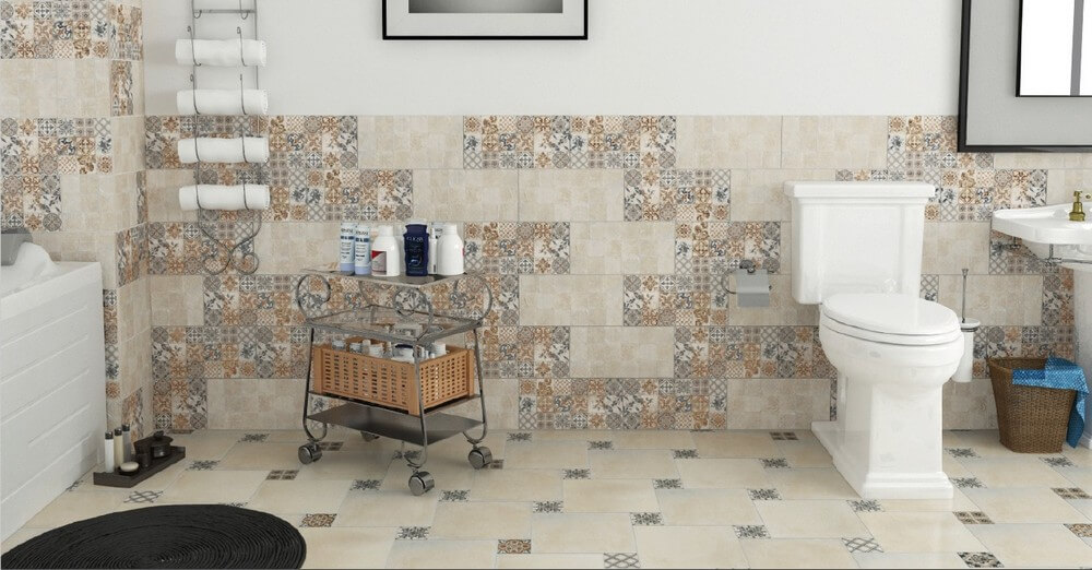
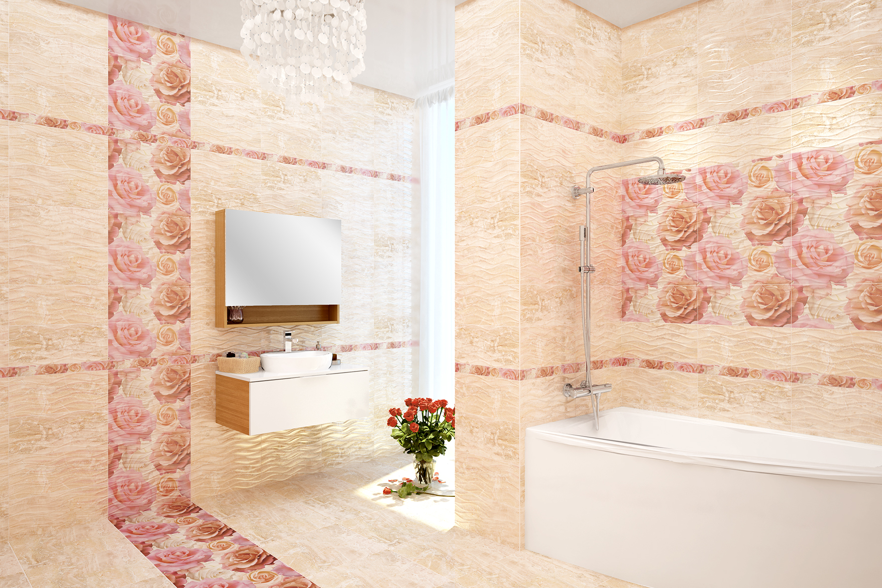
The bathroom can be finished completely, diluting the beige sand companion and tiles with flowers.


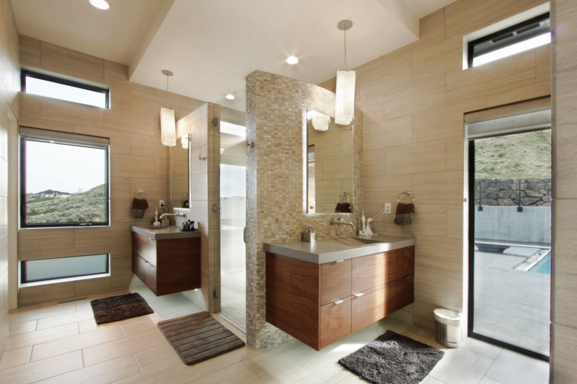
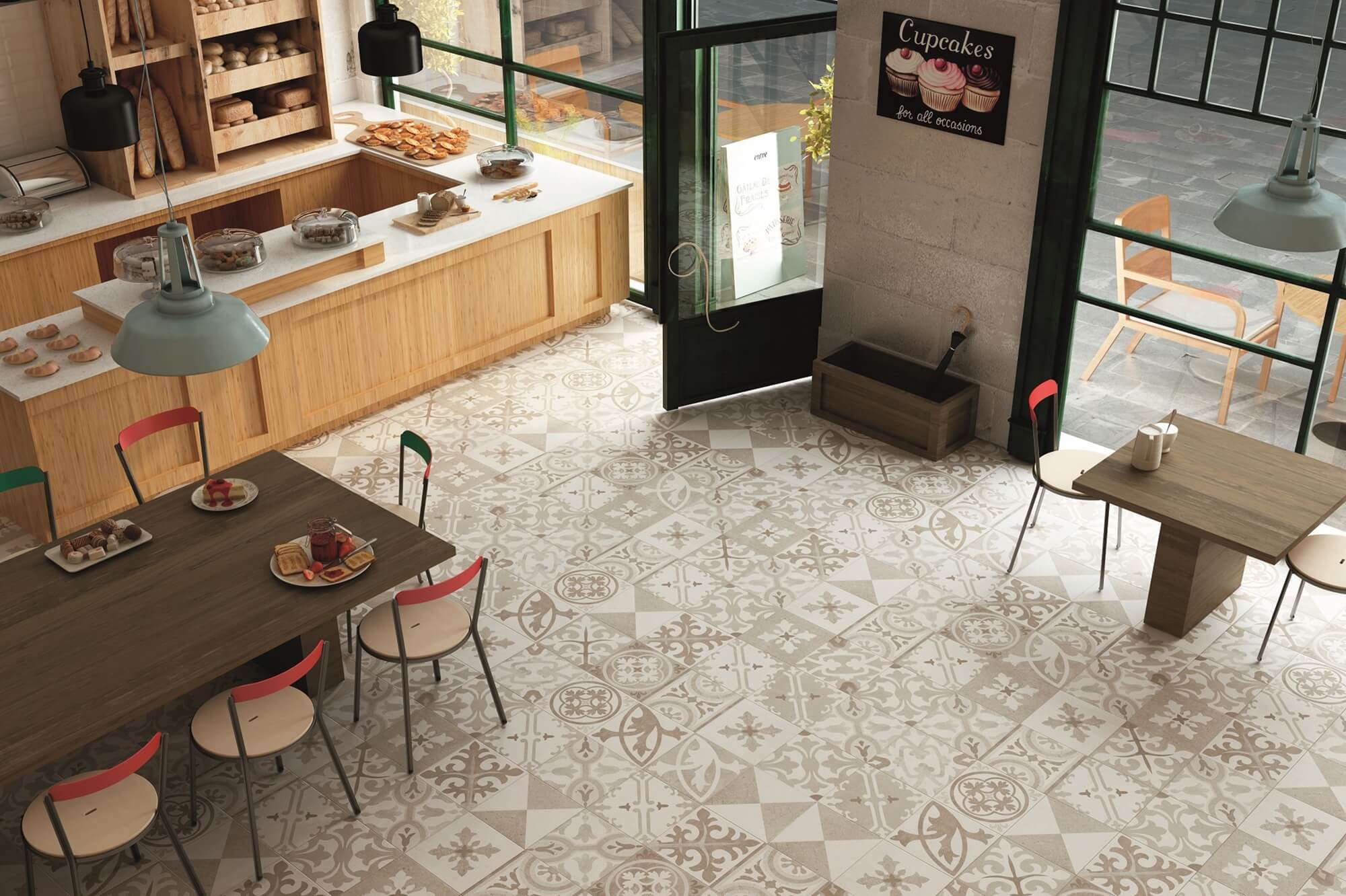
The open plan will be decorated with stylish finishing of the kitchen area in two types of tile.

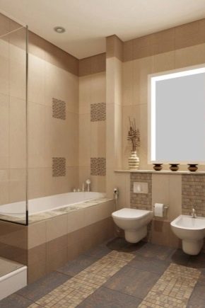
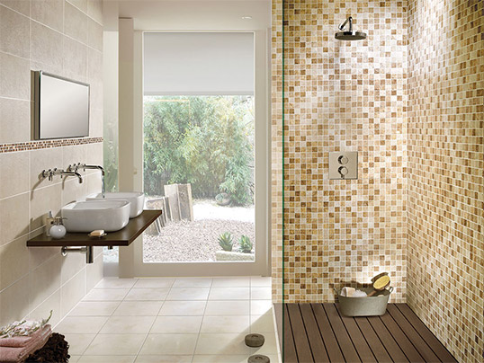
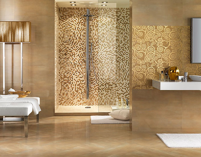
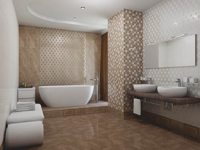
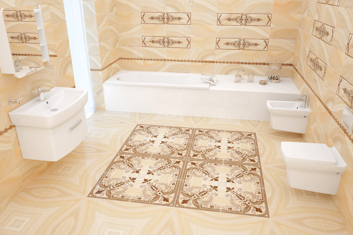
An example of a stylish and harmonious bathroom using three types of tiles, observing zoning.
See the next video for even more interiors with beige tiles.


